
UX Case Study
CardWise Case Study
Helping users manage credit cards with clarity and confidence.
CardWise is a credit card management app designed to help users view balances, track due dates, understand rewards, monitor spending, and feel more confident when making payments.
Role
UX Designer & Researcher
Timeline
10 Weeks
Platform
IOS
Tools
Figma, Excel, FigJam, Gemini


Video Length: 1 minute & 34 Seconds
Video Length: 2 minutes & 44 Seconds
1.
Problem + Key Insights

Marketing Manager
Alicia R.
“I want to stay on top of my bills and avoid any surprises.”
Core Need: Track balances and due dates clearly.

Software Engineer
Marcus L.
“I like optimizing rewards, but I need a faster way to see what matters.”
Core Need: Maximize rewards and understand spending patterns.
Due dates are easy to miss
Rewards are hard to interpret
Credit utilization feels confusing
Payment reassurance matters
Key Insights
The Problem
Users struggle with fragmented credit card information, missed due dates, unclear rewards value, confusing credit utilization, and lack of confidence when making payments.
Journey Map:
This journey map shows that users needed reassurance before and after making a payment, which led to improvements in the payment review flow, confirmation screen, and progress tracking experience.


Before
1
2
3
4
2.
Process Snapshot

After
Balances, due dates, and utilization are grouped upfront.
Users receive simple status language and a helpful tip.
Users see amount, date, confirmation number, and reminder support.
Research
Reviewed secondary research, competitor patterns, and user pain points.
Wireframe
Mapped dashboard, card detail, payment, rewards, and insights flows.
Refine
Improved hierarchy, labels, and confirmation moments.
Prototype
Built a high-fidelity prototype for payment and dashboard flows.
Design Focus
Make payment info easier to scan, act on, and trust.
Clarity
Urgency
Reassurance
I moved from research and journey mapping into low-fidelity wireframes, then refined the experience around clarity, urgency, and reassurance. The goal was to reduce mental load and make the most important financial actions easier to understand.
Important information felt separated.
Users saw a number without guidance.
Confirmation felt generic.
3.
Final Solution
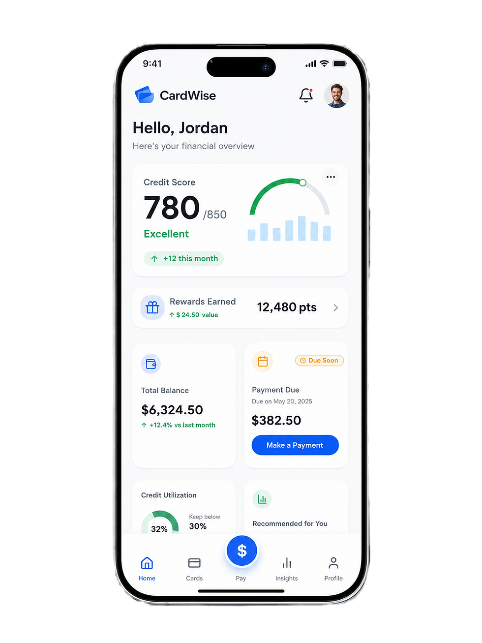
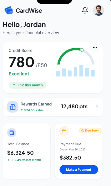
Dashoboard
Briefly overview of balances, due dates, utilization, rewards, and spending trends.
Card Details
Users can manage card information, credit limits, due dates, and quick actions.
Make a Payment
A clear step by step payment flow helps users review before confirming.
Spending Insights
Category trends turn spending data into understandable patterns.
Rewards Tracker
Points, value, and redemption options are easier to understand and act on.
The final CardWise experience puts the most important information front and center so users can manage credit cards with less confusion and more confidence.


Design Highlights
Prioritized due dates
Important dates appear early so users can plan with confidence.
Clear payment reassurance
Important dates appear early so users can plan with confidence.
Simple rewards tracking
Users can understand points, value, and redemption options.
Actionable spending insights
Trends and categories help users make smarter decisions.
4.
Impact + Takeaways
32%
Users completed key tasks significantly faster.
Faster task completion
28%
Fewer errors in payments and navigation.
Increase in accuracy
94%
Users reported a positive overall experience.
User satisfaction
100%
Built with WCAG 2.1 AA standards in mind.
Accessibility aligned
CardWise delivers a clearer, faster, and more confidence-building credit card management experience. The redesign focuses on clarity, trust, accessibility, and actionable guidance.
Key Takeaways
Simplicity reduces cognitive load and builds financial confidence.
Transparency and timely guidance create trust during payment moments.
Actionable insights help users make better financial decisions.
Accessibility should be part of the design system, not an afterthought.
WHAT I LEARNED
CardWise taught me that financial design must build clarity, trust, and confidence at every step. Users need more than numbers on a screen. They need plain language guidance, clear priorities, and reassurance before and after taking action. By focusing on due dates, credit utilization, rewards, payment review, and confirmation feedback, I learned how thoughtful UX can reduce anxiety and help users feel more in control of their financial decisions.